The Best Block in Squarespace
Introducing the most useful block in Squarespace…
*drumroll*
The Spacer!
Did you get it?
Squarespace is a powerful website platform. It can do some really amazing things. But sometimes, it’s the simple things that can be the most brilliant.
The spacer block is underrated, I’ll give you that. But it can help us to achieve website designs that are functional and beautiful.
Let’s dive into my favourite Squarepsace block.
What’s a block?
First up, if you’re new to Squarespace you might be wondering…what on earth is a block?
It’s the drag and drop features that form the content of your site. We use them to edit our pages with things like text, images, forms and buttons.
The rules
Now, onto the rules of a spacer block. When using spacer blocks on Squarespace, they may alter when your site switches to mobile.
Spacer block + [content] = [content]
The content will appear on mobile. For the example below, the button will appear on mobile.

Spacer block = spacer block
The spacer block will appear on mobile.

Spacer block + Spacer block = cancelled out
Neither will appear on mobile, content will be moved up

1. White space
I’ll let you into a design secret here: white space is the key to beautiful modern design.
If I land on a website that’s full to the brim with content trying to shout louder for attention, I click straight outta there. Headache avoided. Phew.
Why do you think Google is the top dog when it comes to search engines? Well, part of it could be down to their design. Look at all that white space, easy and relaxing for users. They know exactly what we’re showing up for: to search. And search we do!

This feel is super easy to take leaf out of Google’s book and apply to our own websites in Squarespace. Here’s how…
- Upload your content that you want to focus on
- Simply place spacer blocks above, below or to the sides of your content to give it the focus it needs. To do this, hover over the place you want to place the spacer and select it from the list of blocks. Don’t forget you can drag and drop these blocks until you find a layout that works for you and your content.
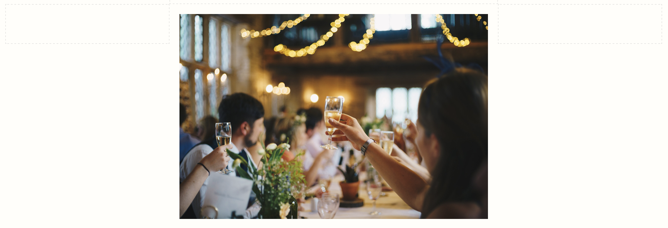
Here’s an example of the end result. Nice and spacious, right?

2. Banner Images
It’s a similar story with banner images. (Banner images are images that fill the width of our screen).
On Squarespace you will find that some templates allow you to change the height of these images in the style editor settings. For most templates, the best way to control the height of banner images is through the spacer block.
Take the example below. By using space blocks above and below the ‘let’s chat’ block, we are able to really show off the banner image in all it’s glory.


To achieve this, we have followed the instructions from 1. White Space, beginning by placing a banner image behind your content. (Please note you are unable to do this on all templates).
You can use spacer blocks on all banner images to create consistent banner image heights. So instead of clicking on your spacer block and expanding it down, you add in extra spacer blocks to make up the space. So I might make my banners 5 spacers tall. Consistency and a clean look is crucial for a functional website so it’s worth taking the time.
3. Align Text
Have you added a new bit of text to your website recently? Perhaps you pasted in your new copy and it’s the width of your website. Reading your text is like watching a tennis match from the net 🎾, back and forth, back and forth. You don’t want to give your audience neck strain!
The answer lies in (you guessed it): spacer blocks!
The spacer block is a really useful tool for aligning your text on your website.
How? To make text central, we add a block of the same size to each side of our text. Or to move it to the left of our page, we add a spacer block to the right of the text.
Changing the width of your spacer blocks will change the look of your text:

4. REsize Images
When uploading a new image to Squarespace, it appears HUGE, nearly taking up the whole of the screen.
Placing text next to your image will reduce the size of your image. If you simply want to reduce the size of your image alone, try using spacer blocks.
To do this, add spacer blocks to the side(s) of your image.
If your image still feels too big then you can drag up the grey circle underneath your image.
Here we have combined an image (left), some text (centre) and a spacer block (right) to create a fresh look. It’s easy to have fun with the spacer block!

So there’s four easy ways to use the spacer block to transform your website into a functional and beautiful site. It’s going to look fabulous!